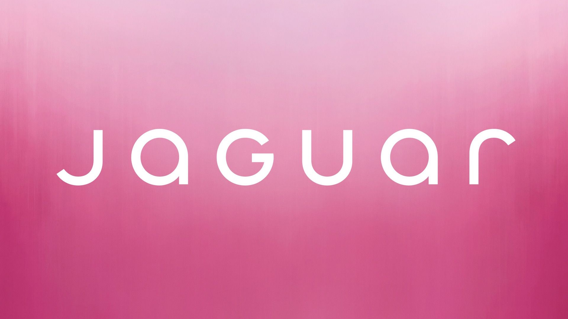
Jaguar is updating its famous logo

Jaguar has introduced a new logo emphasizing its aristocratic British pronunciation as it enters a «new era» that will highlight its impending all-electric vehicle portfolio.
The 102-year-old luxury manufacturer is replacing its previous logo, which had all capital letters, with a new one that is intended to be a «powerful celebration of modernism,» the firm stated Tuesday.
The first electric car under the company’s reimagining is scheduled to go into production in 2026.
The gold-colored Jaguar letters, created using a unique typeface, are spaced out and in lowercase, with the exception of «G» and «U,» which the business claims illustrate the «unexpected by seamlessly blending upper and lowercase characters in visual harmony.»
Other improvements to Jaguar’s branding include a revamped pouncing cat emblem known as the «Leaper,» as well as a new monogram incorporating the «J» and «R» in the company name. According to Car and Driver, the Leaper, which has been on the company’s vehicles for decades, is being replaced with a badge.


